Sexcel
A wellness app that helps parents talk to their kids about sex
Brief
Choose a specific aspect of the growing health and wellness market. Design an app that will help people adopt and commit to a health-improving routine.
Time
One week
Team
3 UX designers
Deliverable
Hi-fidelity prototype showing the main user flow
Role
UX designer, UI designer, UX writing, microcopy writer, UX Research, Information Architecture, Design System, UI Design, Prototyping
The problem | how to have ‘the talk'
Parents of 4-18 year old kids want to have positive conversations about sexual health with their children, but they don’t know which topics are appropriate to address at which age and maturity level.
This makes them feel uncomfortable approaching these conversations.
The Solution | From prudish to positive parent
Sexcel is an app that sets up parents to succeed at talking about sex by providing age-appropriate conversational topics and a progress page to make sure they have every topic covered.
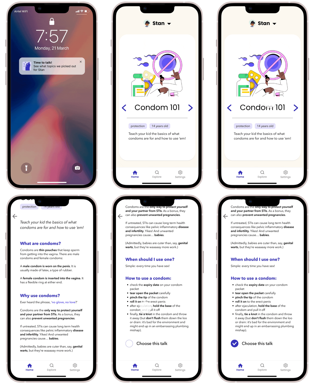
Parents get a reminder to talk
then swipe through to choose the age-appropriate topic they want to talk to their child about that day
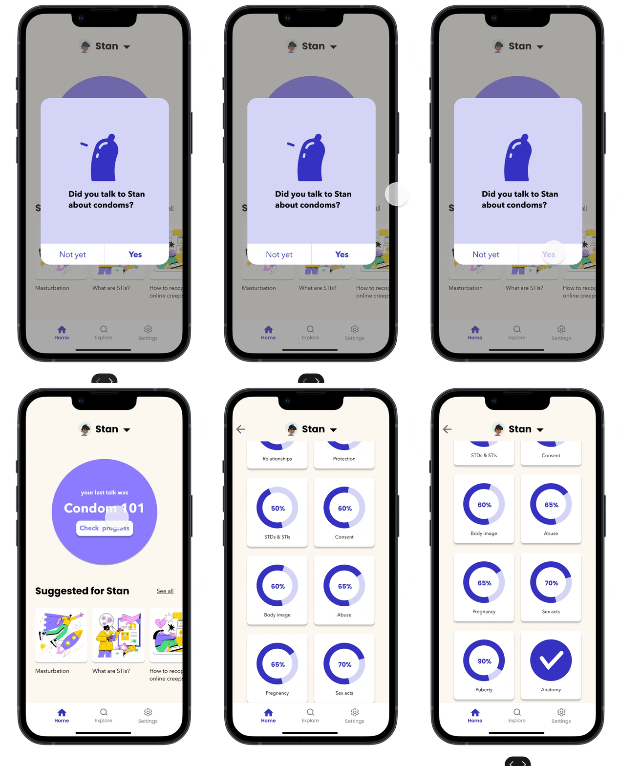
The talk is added to the dashboard
and the progress page the next time the parent opens the app
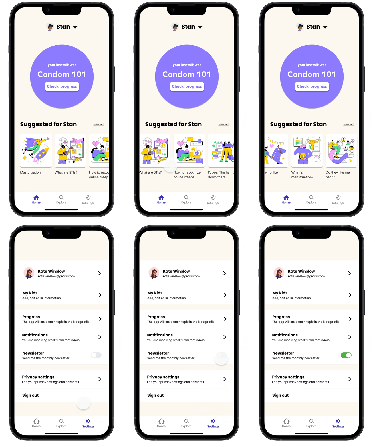
Each kid has a personalized homepage
with relevant topics, and in the parent’s settings they can choose how frequently they want to receive reminders to talk
The research | ask the parents
For our app, we chose to focus on sex education, with parents as the primary user.
Why? Because what parents say matters!
87% of teens say it would be easier to delay sex and avoid pregnancy if they could have more open conversations about it with their parents
Teens who report having good conversations with their parents about sex are more likely to delay sex, have fewer partners, and use condoms and other birth control when they do have sex
While many tend to think of the ‘sex talk’ as one big speech, experts recommend parents have these conversations on a regular basis. (Which, as it turns out, can also ease parents’ discomfort.)
In order to understand parents’ attitudes and behavior towards sex education, we:
Did secondary and market research of over 15 online sources for sexual health information
Interviewed four parents of 0-14 year olds living in Spain and the Netherlands
Analyzed the survey results of 24 parents of 0-18 year olds living in Spain
First of all…
However…
Why?
‘I find it awkward.’
‘I’m not sure what information is reliable.’
‘They know so much already because of internet and social media; it’s hard to know what are (still) useful topics’
‘I don’t know which topics I’m supposed to talk about at which age. I usually just answer my kids’ questions as they come up’
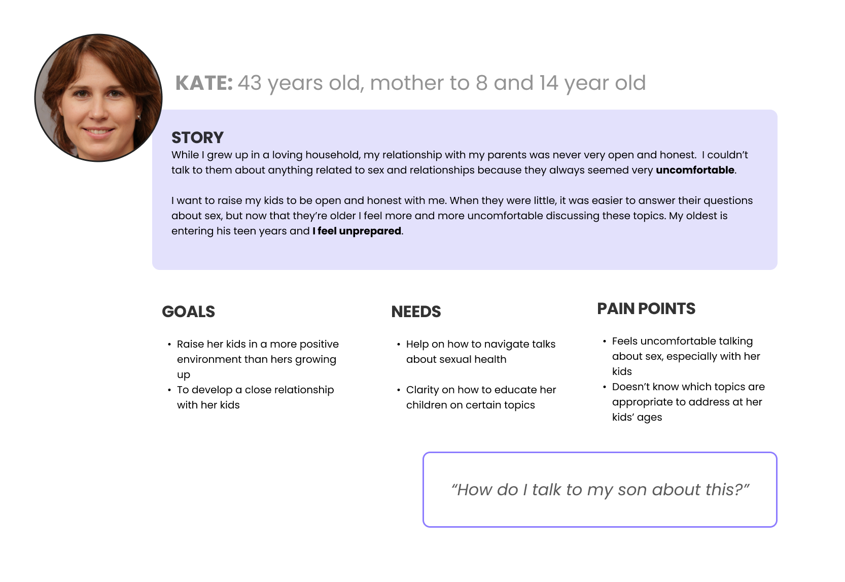
The user | The prudish parent
Competitive analysis | A gap in the market
Since there weren’t many sex ed apps geared toward parents who want to talk to their kids, we did a competitive feature analysis of several different apps and websites to see how they were approaching various elements.
ideation | A sexy solution
In order to think of a solution, we used brainstorming and Crazy 8s, then put our ideas into a MoSCoW diagram
Design | from prudish to positive parent
Scenario: Kate has set up her app to get weekly reminders to talk with each of her kids. This frequency gets her into the habit of proactively talking about various sexual health topics, which eventually eases her discomfort.
Flow 1 starts with a planned weekly notification for logged-in user Kate
Flow 2 starts the next time she opens the Sexcel app
Flow 1
Flow 2
Design | style guide
Once we figured out the main user flow, it was time to come up with a style guide. We chose a fun palette that would appeal to both parents and kids alike (because eventually, we wanted to add kids as users).
Design | Feedback and testing
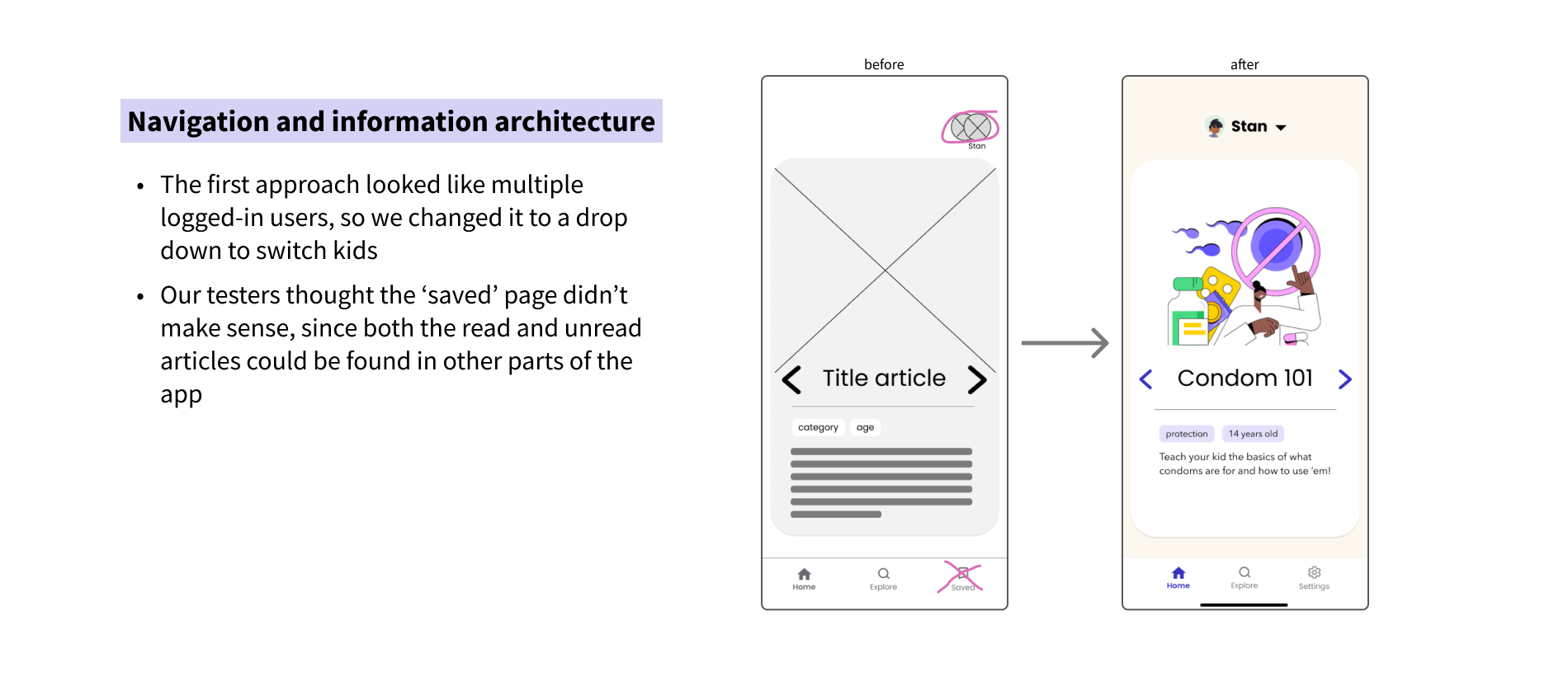
Based on designer feedback and usability testing of 8 people, we made several iterations of the app. These were the biggest changes:
final screens | sex ed in style
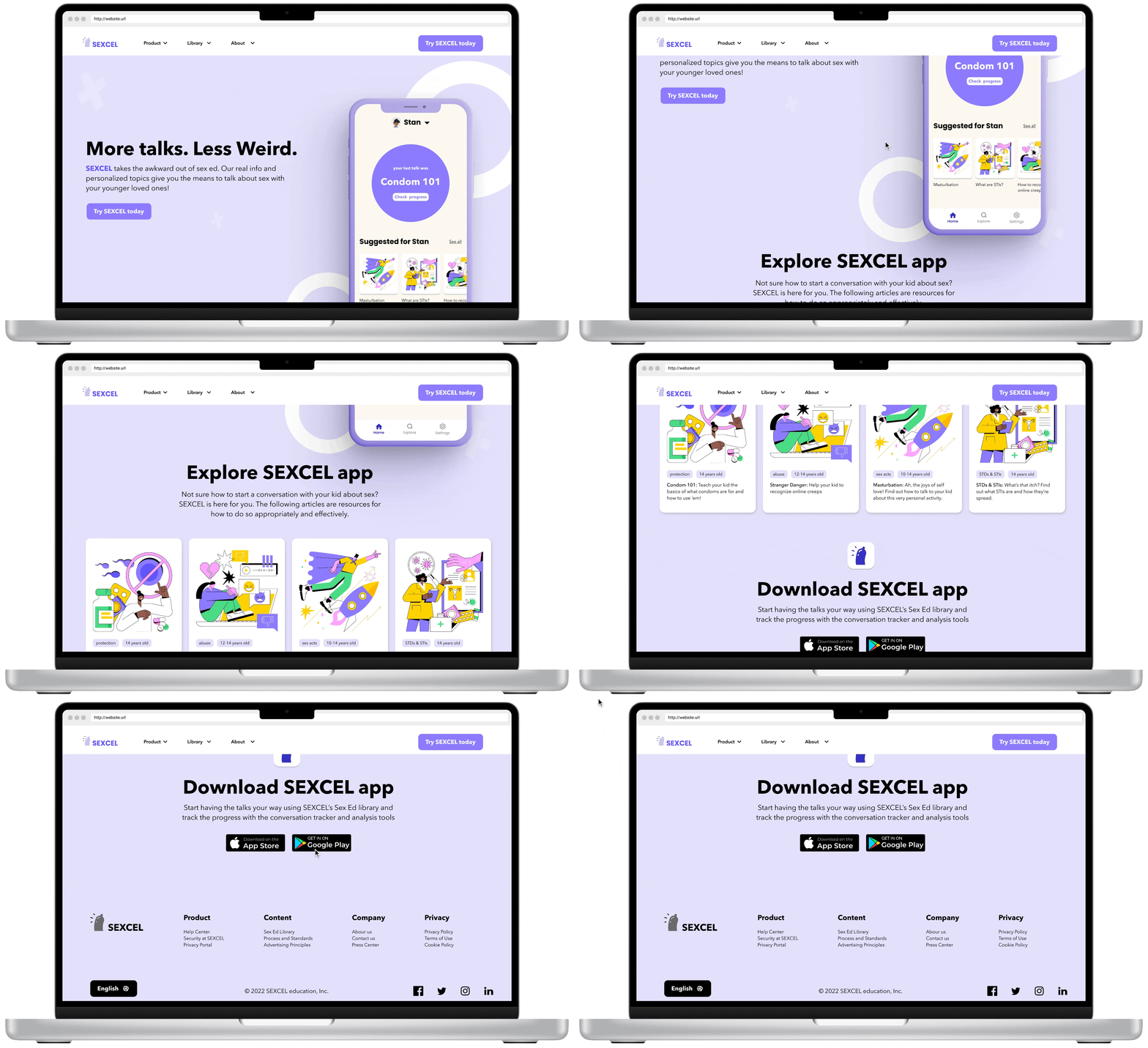
Desktop version | sex ed from anywhere
On the desktop version, parents can find out more about the app and the idea behind Sexcel. They can also read a sample of the articles available in the app.
Key learnings | smart is sexy
What I’d do differently next time…
This was my first time designing an app from scratch. I’m really proud of what my fellow designers and I made in just a week’s time, and I learned some important lessons along the way.
Keep mid-fi prototypes more simple and not too detailed. Even though our instructor (ahem) told us this from the beginning, we quickly got caught up in the UI design before properly testing and iterating the low- and mid-fi wireframes. In the end, this cost us time, as we had to fix a lot of issues in the high-fi stage. Which brings me to the next point…
Test mid-fi wireframes at an earlier stage. Some of our ideas really didn’t make sense once we got to the final product, so if we had tested them earlier, it might have saved us a lot of trouble.
When your idea lacks direct competitors, think broader. While looking for competitors in the helping-parents-talk-to-their-kids-about-sex market, we really didn’t find any (side note for any investors out there: this seems to be a gap in the market :). We had to think about the broader goals and value of this app and look to other competitors in health, wellness, and education.
Next steps | Let’s go all the way
Phew! This was quite the design sprint, but there was so much more we’d love to do with more time.
After this, we would…
Do more testing on the current app
Make a version of the app for kids
Add content that parents can share with their kids, like:
Animations and videos
Family games and quizzes about Sex Ed
Thank you for reading!
Email me at meghoffman.ux@gmail.com if you want to work together, or just to grab a coffee. I’d love to hear what you think!
