Percentil
An e-commerce app that helps give secondhand clothes a new life
Brief
Design a native app for a popular e-commerce website for secondhand clothes.
Time
Two weeks
Team
3 UX designers
Deliverable
Hi-fidelity prototype showing the main user flow
Role
UX designer, UI designer, UX writing, microcopy writer, UX Research, Information Architecture, Design System, UI Design, Prototyping
The client | percentil
Percentil is an e-commerce platform focused on sustainable second-hand fashion. They are committed to reducing the impact of fast fashion while enabling people to dress for less. The company is renowned for its strict quality control and exceptional customer service.
The challenge: they want to increase customer loyalty and create a more personal shopping experience by having our team create a native app.
The problem | Secondhand insecurities
Quality-driven secondhand shoppers want to efficiently change their wardrobe without impacting the environment or sacrificing quality, but they are often overwhelmed by the choices available.
The solution | sustainable success
With the Percentil app, users can choose their style during the onboarding process, which leads to a customized home page. Improved search and filtering makes it easy for them to find exactly what they want, while the more prominent value proposition lets users see their positive impact on the environment and feel good about their purchase.
Secondhand shoppers set their style
during the onboarding process, leading to a customized home page showing clothes that are a great fit.
Gain: Secondhand shoppers can save their size and style preferences, which ultimately saves them time when online shopping.
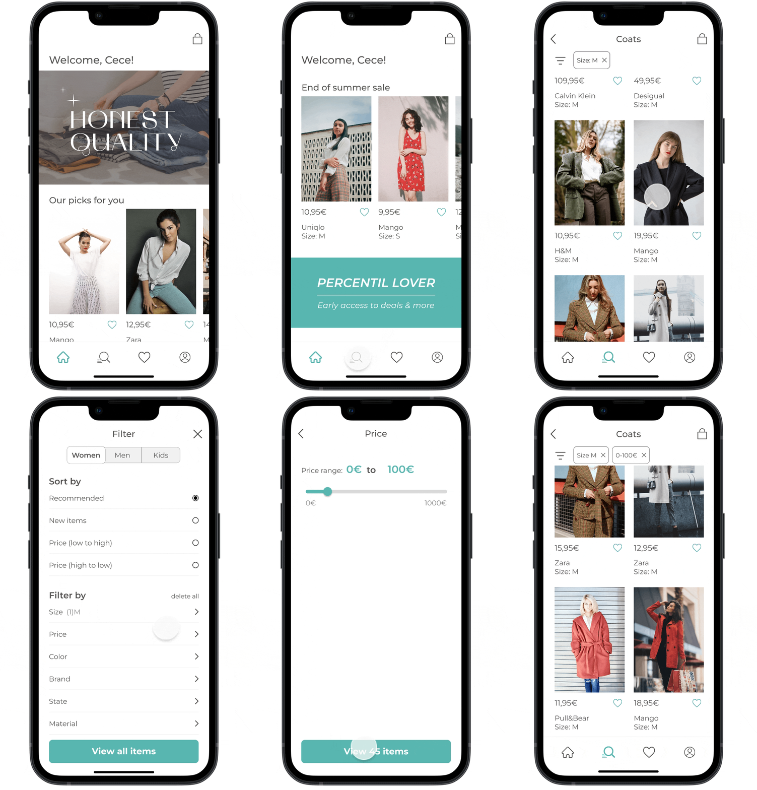
Clean, clear search and filters
help users quickly find and refine what they’re looking for.
Gain: Percentil’s huge catalogue feels less overwhelming, and shoppers can more easily find what they want.
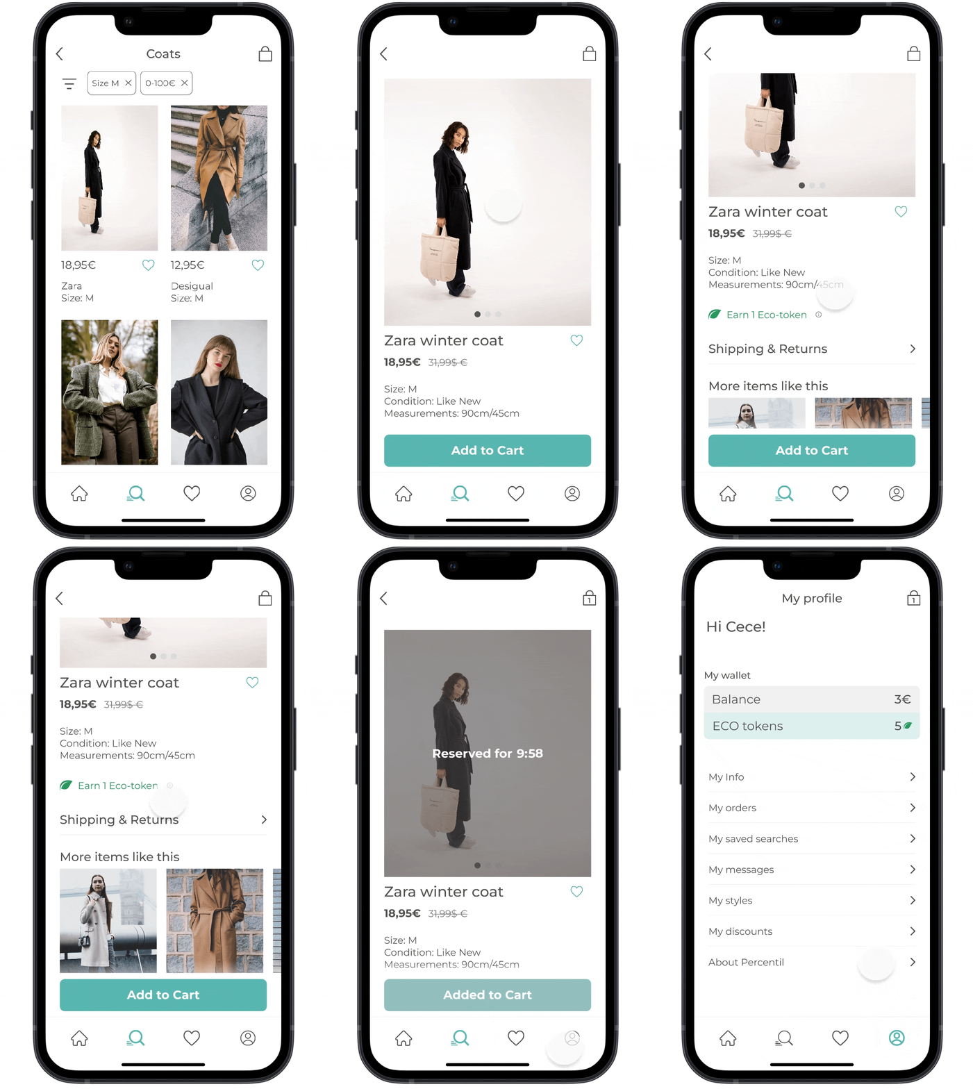
Shoppers measure their positive impact
on the environment with ECO tokens, which not only show the carbon offset for each secondhand item, but also work as a reward system.
Gain: buyers feel good about their purchase and build up ECO tokens, which they can trade in for special perks and discounts, so they keep coming back.
The research | market & competitive analysis
In order to better understand what actions were needed, we:
did secondhand research on the secondhand clothing market;
analyzed 7 competitors, and;
did a UX audit of Percentil’s current website.
As awareness of the negative effects of fast fashion has risen (i.e. cheap clothes that are mass-produced and typically thrown away within a short time frame), many consumers are turning to secondhand clothes as a way to save money and promote a more circular economy.
However, searching through racks of vintage clothes to find items of good quality in the right size is typically more time-consuming than buying new. Shoppers want the convenience of fast fashion without the negative environmental impact.
Unlike some other online secondhand marketplaces, sellers send their items to Percentil in prepaid mailing bags, and every item sold on the website goes through strict quality control.
And customers love it! Percentil has a 4.1 star rating on TrustPilot, where customers point to their good customer service and high trust in the quality of the items.
While Percentil scored high on customer service and product quality, our UX audit of their current website revealed an overwhelming catalogue, confusing filters, and an unclear value proposition.
We wanted to see if our user research would back up our findings.
user insights | buyers’ desires
To find out what our target users were looking for when buying secondhand clothes online, we conducted:
8 contextual observations;
21 surveys, and;
5 user interviews of members of our target audience: women aged 20-35 who shop for secondhand clothes online.
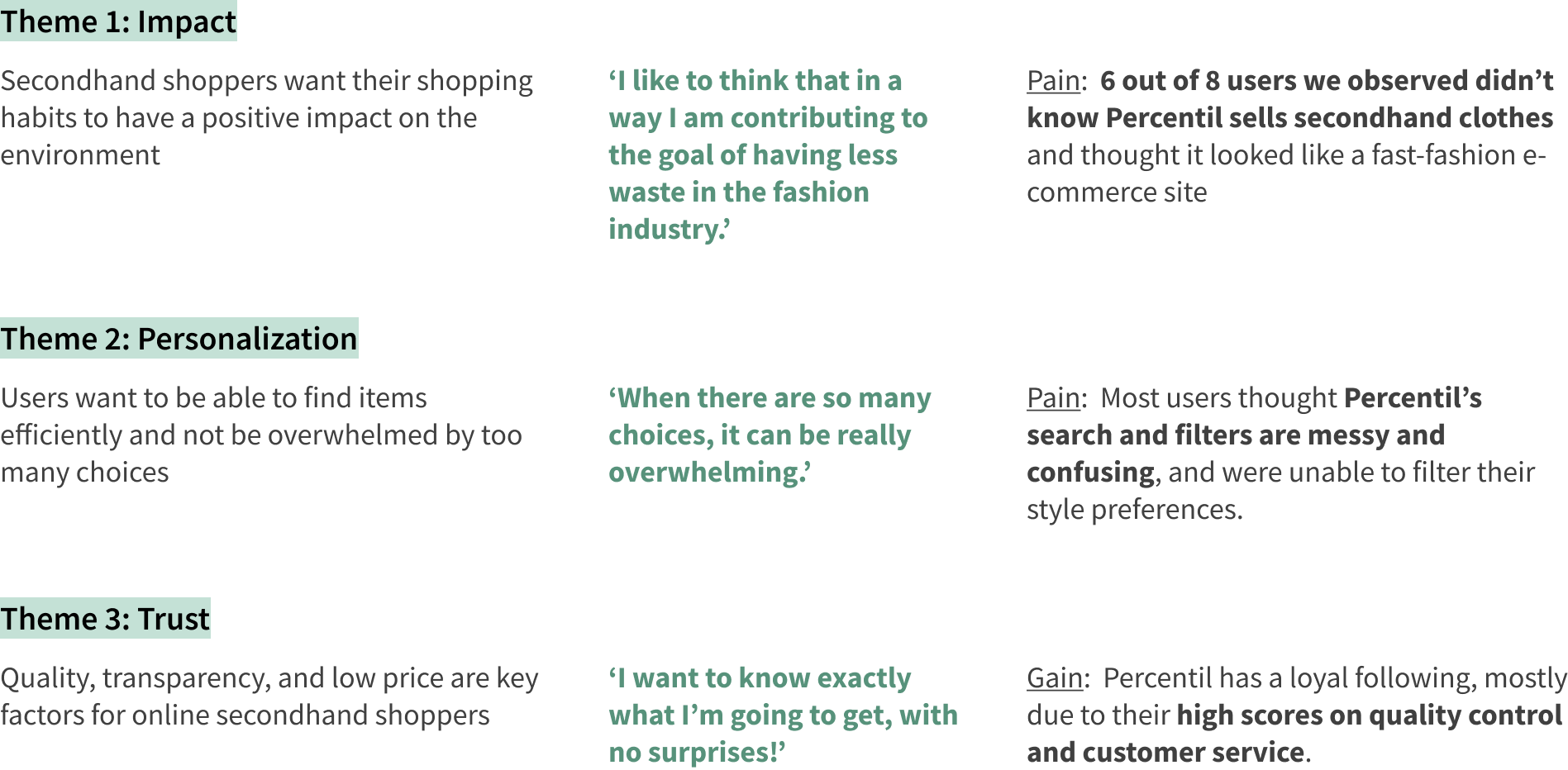
After grouping our findings into an Affinity Diagram, the following three points stood out:
Our survey and observations showed that 80% of users search first then filter the results when looking for an item, so a good search menu is something we would incorporate into the design.
The user | green queens
Based on our research we were able to condense Percentil’s users into two main archetypes:
The user | journey map
Design | mid-fi wireframes
design | Design system
design | feedback & testing
After four rounds of testing, getting feedback from 5 users and 18 designers, here are some (but definitely not all) of the changes we made:
final Prototype | shopping in style
Thank you for reading!
Email me at meghoffman.ux@gmail.com if you want to work together, or just to grab a coffee. I’d love to hear what you think!


